

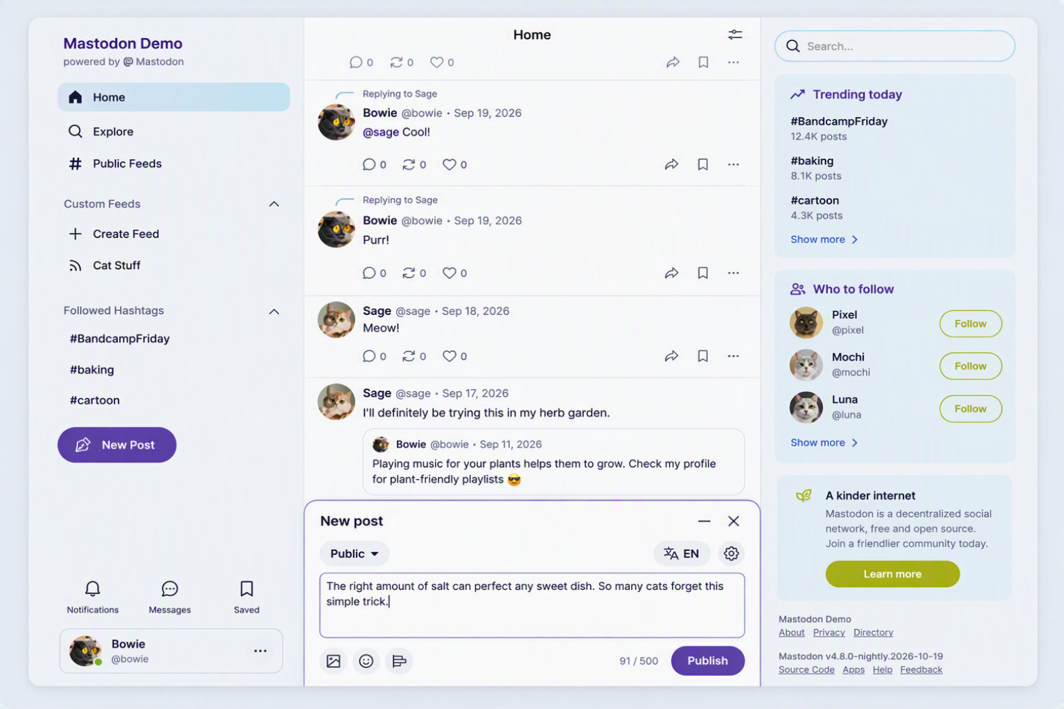
#Mastodon is getting a new look in our upcoming 5.0 release.
We wrote a bit more about our design process and how we approach community input. If you’re on mastodon.social you will see the new design tomorrow, on Tuesday. We rely on your feedback!
#Mastodon is getting a new look in our upcoming 5.0 release.
We wrote a bit more about our design process and how we approach community input. If you’re on mastodon.social you will see the new design tomorrow, on Tuesday. We rely on your feedback!
@Mastodon "We didn’t want to require you to have a GitHub profile"
Thank you. I don't think I'm technically-illiterate, but I still can't understand how that site works.
@Mastodon
Did you guys stop using Zulip or are you keeping it for team coordination?
@tuneintodetuned @Mastodon We still use Zulip internally, but figured out that Discourse would be a better platform to engage with the broader community
@renchap @tuneintodetuned @Mastodon Could you enable AP plugin there? We did that on SocialHub: https://socialhub.activitypub.rocks/ap/about
@Mastodon The kind of "detail" I do appreciate. Thank you !!!
@Mastodon Any chance it would be possible to add logging in/signing up with a Mastodon/Fediverse account instead of having to create yet another one?
@Mastodon Thanks for being inclusive with the non-techies with that community!
@Mastodon Great thx. Also thx to @codinghorror & team for providing that excellent piece of software.
@Mastodon amazing! Why not just a classic mailing list?
@Mastodon So, why don't you use ActivityPub forums Lemmy?
@Mastodon Thank you. I struggled with GitHub. Much nicer to have a human-friendly forum to report problems and provide feedback.
Already made my first UX feedback post.
@Mastodon Now how about you stop trying to police the way people use the word mastodon like the fucking ministry of truth?
@Mastodon Thank you for the no-Github and for the discourse :-)
@Mastodon But we need to sign up for an account on Discourse to do it?
Thanks for the feedback forum! :)
@Mastodon i hate the new version! 😂
@Mastodon Or you could... look at your replies... on your social media site... that you run.
You know.
So we don't need to sign up for yet another site? Which doesn't even say it's a different login? It has the mastodon logo in the corner, ffs!
@Mastodon Instead we need accounts for that instead?
@Mastodon mastodon really is a great product! Well done on the design!
Tried to comment on forum. In brief, I'm unable to use Mastodon now (on desktop). Notifications, Account buried under left column, center is one big amorphous feed (with this post appearing mid-thread), and entire right third is blank. Cannot easily see feed and notifications (my main activities) OR initiate a new post, as it's now a button, again, way down the left column. Unusable. 🥲
Mastodon social staff are a bunch of faggot ass BITCH German fucks and i hope their CHILDREN GET KIDNAPPED BY THE CARTEL AND GET THEIR PATHETIC THROAT SLIT OPEN. FUCKING LOSERS!!! TRY ME IN REAL LIFE! I PROMISE YOU WONT FAGGOTS!! NOT IN A MILLION YEARS WOULD YOU EVER TRY ME FAGGOTS!! I PROMISE YOU THAT COWARDS!!! 🖕
@Mastodon I was intending to give a quick comment about the new UX but the requirement to create yet another account did generate enough friction for me that I didn't want to do it. It would be nice to have feedback in-app (or at least something like discord where you have one login many "forums"). FWIW my main issue is that the important links (home / profile / notifications) are now tiny icons at the top while the rare stuff (create feed / saved posts / ...) are large and prominent.
@Mastodon great developments!
I have one request, can you please adjust this heading? Especially the second word. Thanks.
Clarity trumps convenience
@mimi @mbootsman @Mastodon I’m guessing it’s because of the verb “trumps”.
@Mastodon Love this design, so clean and modern, great work ✨
@Mastodon Thank you for finally addressing this issue, I think calling them "likes" and using a heart icon is way nicer, and most people nowdays will understand it way better!
@Mastodon @dansup Wow. @velvetshadow t’as vu ça ? Ça a l’air super clean !
@velvetshadow @raph @Mastodon On a testé le composer dans le coin en bas à droite (à la gmail), les gens se sont plaints (trop loin du bouton). En modale, les gens se sont plaints (pas possible de browse en même temps). Donc nouvelle tentative, pour voir ce que ça donne. Ce qui est certain est qu’il doit être à un endroit qui a plus de place disponible par rapport à avant.
@Mastodon "We’re headed towards more roundness to invite a friendlier brand tone, and to make Mastodon feel more native within modern browsers (most of which have adopted a rounded aesthetic)."
Oh, FFS, first it's Firefox that have fallen for this and now its Mastodon.
Maybe we need alt. themes for both.
@landelare @Mastodon When do you think was the last time?
@Mastodon I like the overall design. But I don't like the use of color. Mastodon only has versions of violet in its' color scheme. To me it's lacking secondary colors for accents and to really show a hierarchy of elements. Although I don't realy like the violet as it makes everything look sad, I accept that it is the established color for mastodon. But there should be complementary secondary colors that are not just a variation of the primary color. And making the base-color freely definable doesn't make it better.
I am not a designer, but it could look far more friendly and happy with a touch more color.
@Mastodon I hope we will be able to copy and paste, to allow translation of interesting posts in other languages from people around the world. Information and knowledge is limited without being able to translate.
@Mastodon
no embedded composer anymore?
will I still be able to browse the timeline and looking for other posts while the pop-up composer is open?
@Mastodon I'm already on nightly; the new design looks great, and everything works as expected (as far as I can tell). I'm happy with the new popup composer. Thank you for providing amazing software all these years!
@Mastodon But why put the composer at the bottom center instead of just the top? Newer posts are usually added on top, so why should I add mine at the bottom?
Wouldn’t that also be more aligned with this statement?: “Whenever possible, we’ve based the redesign in existing UI patterns used frequently across the web, […]”
@Mastodon looks great, I hope the round avatars will be adapted for mobile apps as well
@Mastodon
Notifications should really not be at the bottom left on desktop web sites when traditionally their place is the top right. (as the gaze naturally is at the top part of the screen, important information like notificatiors should be there too)





























 et hâte de voir le rendu en dark mode !










We didn’t want to require you to have a GitHub profile to report issues or suggest ideas, so starting now you can do it on our new community forum.
You can also vote for other people’s ideas to keep things manageable. It’s the main place we’ll be looking for feedback!
https://community.joinmastodon.org/
Mastodon Community Forum