

Slack is fascinating to me because it was originally a huge hit as an additional communication tool to email.
However it has clearly accumulated a lot of cruft and seems to lack any coherent product or design strategy which has led to a poor user experience.
This image from @mcc is a great example.







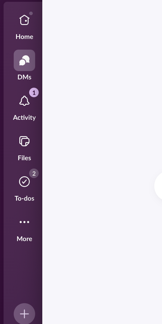

@carnage4life @mcc Worth noting that the moon icon is not a dark mode switch but to enable "focus mode". Why? Nobody knows.