

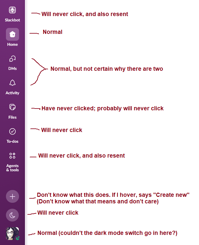
Looking over the Slack side bar and realizing it is at 3/10 "buttons that are there for me" and 7/10 "buttons that are there to make a product manager happy"
0 Boosts
0 Likes

@mcc they used to be a feature called options, quite a few few websites and applications used to have. Seems that the more things get enshittfied, the less flexibility applications have to be customised to the users requirements. See also: almost everything.
I remember when interfaces like this had drag to rearrange - it doesn’t take much in kb to store them in a json file or config .. but then there’s no metrics to boost shareholder value. </cynic mode=off>

@mcc I completely relate.
Does anyone know of a Slack alternative with a better UI and/or the ability to fully customize your main menu?


@mcc This is not to imply in any way that you're "doing it wrong", but one of your "will never click"s is my favorite button, and there are a couple others you don't use that I do and find somewhat useful. So given all the different ways people use Slack, at least some of those other buttons are not *just* making product managers happy.
I'm not saying Slack is super well designed either. I bet almost everyone finds like half the buttons useful and half annoying, it just varies from person to person which half. (We probably all agree on Slackbot though 😛 )
@mcc I am so glad you wrote this down and got it our of my mind.


@mcc Classic fritterware.

@mcc I use To Do all the time to keep track of what's important. What drives me nuts is the search, which I find unusable. But then there's Jira, and Slack suddenly seems like an oasis of sanity...


@mcc The new focus mode (🌙) is the best thing to happen in a few years IMHO. It's one-click and it doesn't only pause notifications and sets a "I'm focusing" status, it also removes lots of visual clues from the UI. I can keep a channel open in my second screen while coding, but I will just not be distracted by things happening in other channels because the unread markers are hidden. It's perfect.
@rami but… I want slack to give me notifications. Arguably this is literally the only function Slack has

@mcc For me, the only way to survive Slack is to enable focus mode and live in the activity tab, clearing out messages that I've handled. Once a day I leave focus mode to clear the rest.


@mcc The Slack UI annoys me in a dozen little ways that I can't quite put my finger on. I feel like it was made by managers in meetings and not by programmers who actually use it.


@mcc i hate that i can't hide the slackbot button


@bunnyhero @mcc I’m seriously thinking of creating a web app and using custom CSS to hide it. I guess that is a way to make people stop using the app.
(If they are as annoying as Google, they change classes and such every page load to make it unhideable.)
Do it! This is one big reason I only used Slack as a pinned tab of my browser. There's not much functionality difference.
I've used ublock origin to hide it and other things I have no need for. There are aria attributes, test ids, glyph names, and other little things to hook the cosmetic filter onto.

@mcc The Slackbot one got me — "will never click, and also resent" is exactly how I feel about it too. Mine's mostly Home and DMs as well, the rest just sits there.


@mcc Remember when the DMs side-tab and the Activity side-tab both got the notification numbers for new DMs (which are already also visible on the home side-tab!), but they didn't get incremented at exactly the same time, so it always looked like you were getting something new even when it was just the same DM surfaced a different way?
I dunno if they ever actually fixed that or not; I disabled Activity/DMs integration as soon as the feuding project managers at Slack relented and allowed this.


@mcc I did you the "Saved" button because I would do a quick pass on work slack and mark all channels read while marking specific messages to review later. Then they changed it to the "to-dos" which required me to set a 'due by' which sucked. Then mystifyingly they brought backed "Saved” but kept "to-dos" in latest update (on my work slack anyway). It's baffling.
But yeah most of it is useless cruft.


@mcc there's some control for us users over what appears there, but as usual, it tends to reset itself every so often and new shit is dumped on users

@mcc @hareldan I was gonna say, most of this stuff I'm confused what it does. I just went through and hid it. Like the activity tab was annoying. Just show me a list of people and a number of unreads. I don't need three views for the same information. I need information density and consistency.
I also feel like people moving stuff to new chats feels very disorienting. And the reply in threads thing seems ok but I don't wanna click into every thread to see it. Why does it open on the right?

@mcc I worked there for a while, 2 things come to mind: the way Slack (the company) uses Slack (the product) is unlike anyone else in the world (we dogfood it a lot), and it hasn't been very successful in translating that to the rest of the world. The second bit is common with other enterprise software: The userbase has very little overlaps, one group does things in a certain way, another in a completely different way. So when a thing changes, it has to accommodate every existing usage pattern.