

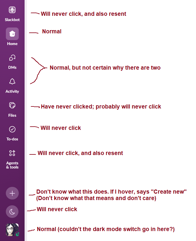
Looking over the Slack side bar and realizing it is at 3/10 "buttons that are there for me" and 7/10 "buttons that are there to make a product manager happy"
4 Boosts
0 Likes

@mcc "Create new" lets you start a new conversation, no?
The moon button isn't to flag yourself as unavailable?
Did you try them out?
I'd put decent odds on slack not even having a product manager in the traditional sense. My guess is that everything ends up in a list of tickets on a backlog and developers pull out what sounds like it would be simple enough. The AI crap probably got pushed from above, but that's it. The rest random user requests and "low hanging fruit".

@mcc This is true in pretty much all commercial software!
The whole structure of how such software is created: team - team lead - project manager - product manager - area manager - vice president - CTO - CEO — this whole structure leads to crap.
(See Conway's Law - he had no idea how bad it would become!)


@mcc I actually wanted to use Slackbot yesterday, but couldn’t figure out how to get to it. My brain has so completely blocked that button I couldn’t see it.

@mcc I get Home, DMs, Activity, Files, To-Dos, "More ..." and Admin. The reason I get "More ..." is because I went into Preferences -> Navigation and turned off "Agents & Tools" so maybe that's an option for you too? You'd still have a "More ..." you'll never click but that's now just one thing.
Also that's not Dark Mode, that's "Focus Mode," which is different and weird. It's a sort of minimal distractions mode.


@mcc You can disable some buttons in the settings, but for some reason some of the checkboxes are grayed out including Slackbot (we know the reason). You can also reorder them so I move Slackbot lower so I don't click it by mistake.


@mcc todo is a weird name, but i love the "remind me about this" feature (at least until the moment i get that reminder 😝)


@mcc I call all these top down user controlless uis hostile design, and apple started it, dictating what users want.


@mcc I've used Slack happily for about 5 years and I just realised I've never used *any* of the side panel buttons.
@mcc I worked there for a while, 2 things come to mind: the way Slack (the company) uses Slack (the product) is unlike anyone else in the world (we dogfood it a lot), and it hasn't been very successful in translating that to the rest of the world. The second bit is common with other enterprise software: The userbase has very little overlaps, one group does things in a certain way, another in a completely different way. So when a thing changes, it has to accommodate every existing usage pattern.

@mcc they used to be a feature called options, quite a few few websites and applications used to have. Seems that the more things get enshittfied, the less flexibility applications have to be customised to the users requirements. See also: almost everything.
I remember when interfaces like this had drag to rearrange - it doesn’t take much in kb to store them in a json file or config .. but then there’s no metrics to boost shareholder value. </cynic mode=off>

@mcc I completely relate.
Does anyone know of a Slack alternative with a better UI and/or the ability to fully customize your main menu?


@mcc This is not to imply in any way that you're "doing it wrong", but one of your "will never click"s is my favorite button, and there are a couple others you don't use that I do and find somewhat useful. So given all the different ways people use Slack, at least some of those other buttons are not *just* making product managers happy.
I'm not saying Slack is super well designed either. I bet almost everyone finds like half the buttons useful and half annoying, it just varies from person to person which half. (We probably all agree on Slackbot though 😛 )
@mcc I am so glad you wrote this down and got it our of my mind.


@mcc Classic fritterware.

@mcc
I tend to ignore the settings and about me pages in any social media. They aren't very friendly.