

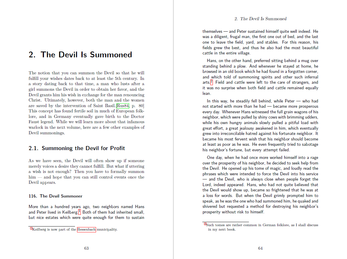
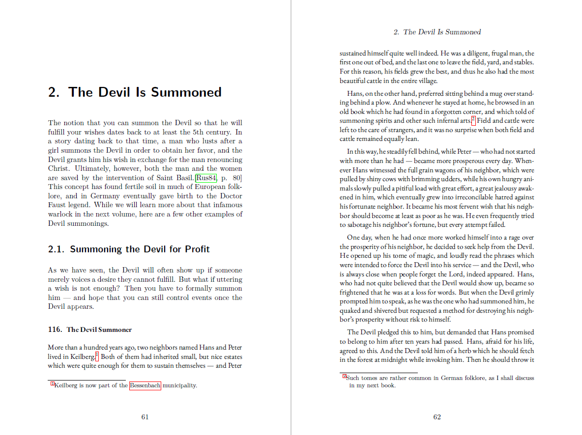
I could use some more #typography advice. In my books, I distinguish between Creative Commons Zero content (the German folk tales I translate) and non-Creative Commons content (my own additional commentary).
In the past, I did this by switching between default #TeXLaTeX sans serif and serif #fonts . However, after the last round of discussions a couple of weeks ago, I decided to try out some different fonts. In the second example below, I have used the Garamond font, which one person recommended.
Does this look better? Or do you have alternative suggestions?
Please boost for greater reach! This is a fairly significant decision which I want to get right before sending the manuscript to the printer.
2 media files



@juergen_hubert I have trouble telling those two fonts apart, so I like the in fact, they're both serif, I think you need more distinctiveness between them, I'll try and remember to send you some suggestions once I get to my PC