

I HATE ADWAITA. I HATE ADWAITA SO, SO MUCH. I PICKED GNOME OVER KDE JUST BECAUSE I LIKED HOW THE INTERFACES LOOK BETTER AND MAYBE I'LL JUMP OVER TO KDE JUST BECAUSE I HATE DECIPHERING THESE FUCKING TRAFFIC PILEUP WINDOW BARS SO MUCH

0 Boosts
0 Likes
@s0x0 They made the title bar real thick (presumably for touchscreen friendliness) and then they're like "oh the title bar is too thick now, we have to put stuff in it".

@mcc On the upside, Linux can now has the same UI quality as Apple


@mcc KDE has been a joy since starting to use it a year ago. Also, very well translated into minority languages! (at least the one i speak)


@mcc lmao wtf is this interface. Does every window title bar look like this or is it QEMU specific?
The button with the diamonds on it looks like a soundcard to me. Like, a PCIe card with a waveform on it. I have no idea what that's meant to mean to a user though.
@mcc Ohhh I get it. You're looking at a VM. The three rectangles of differing shapes are meant to represent keyboard keys. Two modifiers and a regular shaped key, maybe Ctrl+Alt+Delete. The menu I guess lets you send key presses to the VM that might otherwise be interpreted by your host.
And the soundcard icon I guess let's you do... something to do with virtualized sound? Monitor icon probably let's you change resolution of the virtualized display?
But yeah wow these are not readable.
@mcc What does this look like in KDE?
@Misofist I think that is a very interesting question. Checking Google, it *appears* that if you were using KDE you would not have installed virt-viewer in the first place and would run an entirely different program, named "krdc". The page for this app on kde.org makes it look like an entirely normal, non-baffling computer program.
NOW, I KNOW WHAT YOU MAY BE THINKING. "WELL, IF YOU HOVER OVER THOSE ICONS, ARE THERE TOOLTIPS?". NO. NO, THERE ARE NOT. THE ONLY WAY TO FIND OUT WHAT THEY DO IS HURL YOURSELF INTO THE VOID AND CLICK AND SEE WHAT HAPPENS
If there are no tooltips, the blame should be put in QEMU. There is no way to justify not putting a tooltip in a purely graphic button.

@mcc wow. That is, uh… a choice. I was indeed thinking “surely they’ll have the usual hover for tooltip/right click to swap between icon/icon and text/text”.
@Catfish_Man Adwaita has evolved past the need for labels or tooltips… their icons are just so intuitive it doesn't need them
I APOLOGIZE FOR THE CAPITAL LETTERS


@mcc totally justified

@mcc NEVER APOLOGIZE FOR CAPITAL LETTERS CAPITAL LETTERS ARE GREAT
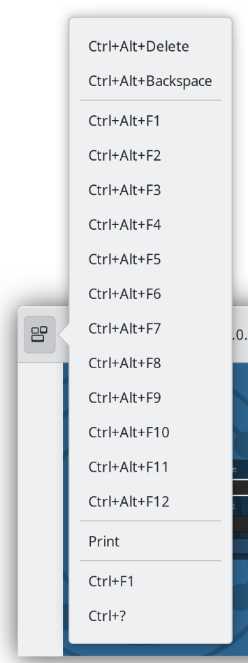
So here's the leftmost menu. Now, I believe I know what this does. But I just want to call this out because I think a reasonable person might be *somewhat confused by the question of what this does*.
The mystery icon next to it? The weird… diamonds… domino mask thing? Guess what happens when you click it.
Nothing. NOTHING. IT'S NOT INTERACTIVE. Or maybe it's interactive under some condition I haven't triggered

@mcc@mastodon.social
it looks like a symbol representing a PCIe card, possibly a sound card if that's meant to be a waveform on it?


@mcc Or maybe it did do something and you don’t know it 🤔. So mysterous.
As an additional piece of trivia, I looked in the hamburger menu, and there is a menu item titled "Normal size". Selecting it does nothing. Under any circumstances, nothing. Tried lots of different sizes, assuming if I could put it to a non-normal size, then "Normal size" would switch it to a normal size. No. "Normal size" does nothing

@mcc it seems warranted

@mcc I hate the loss of the basic window title bar, with simple close/min/max afffordances, and all other app stuff inside it.
We don’t know who started it, but in most of the apps I now use (mostly GNOME but some Mac) I have to hunt for a spare pixel to use to drag the fucking thing.
I suspect one driver was the premium on vertical space on laptops, and the use of full screen apps, but I hate it all the same.
I just want my grippy title bar back.