

Why is the new Mastodon web interface obsessed with showing me a blank column on the right? My four column layout is now a six column layout that doesn't fit in the window and also two of them are blank! This is horrible.
3 Boosts
0 Likes
Here is a completely normal and rational thing for the interface to do. When you click the "like" button, scroll the window and move the post you just clicked on away from where you were looking! Then move it again a second later without any further clicks! "Yes, you are absolutely correct, that is a thing that you wanted and expected."


@jwz it looks like it is changing the presentation of the thread to focus the post you interacted with, and then resetting to the original focus.
This feels like they recognised the problem, but are trying to fix the problem after the fact, rather than stopping it from changing focus in the first place.


@jwz dammit, this reeks of slop. I've assumed the use of AI coding will make Mastodon unusable at some point and I'll want to switch to GoToSocial. Guess that needs to happen before my server upgrades to 5.0.
@scott In years past I would have attributed this to, "You're not as good as you think you are and you do not have a QA team to save your ass" but in This Modern World, incompetence has become indistinguishable from malice.



@jwz I made a better "advanced" client, its an SPA with a ton of customization and a tweetdeck interface.
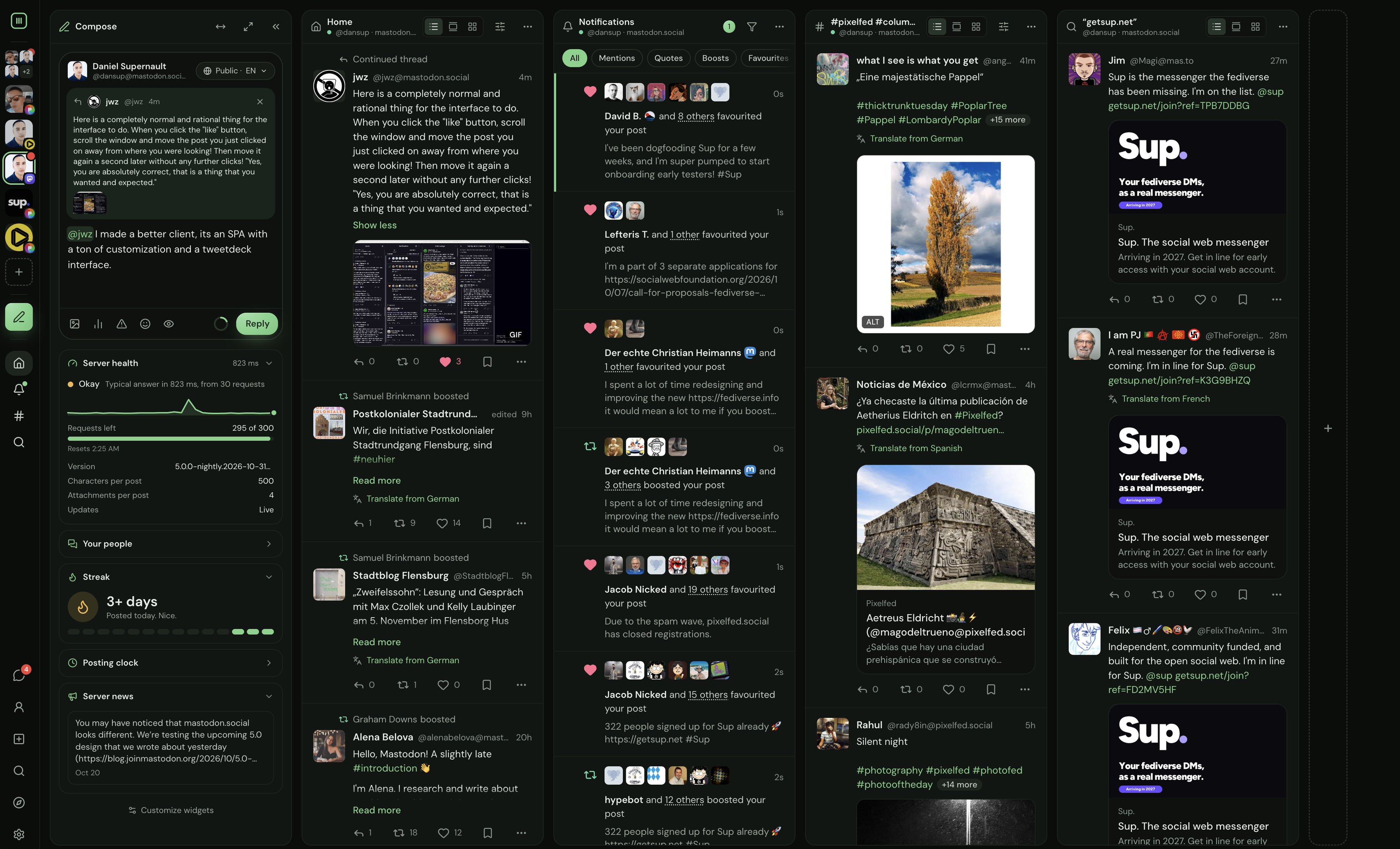

@jwz Never. Use. The. Client. Made. By. The. Service.


@jwz it is so bad I switched over to columnly.social


@jwz Yuck! So glad it doesn't look like that for me.


@jwz I have always gone with a single column and a side bar; sometimes not even the sidebar, but I like having "search" and "new post" there. I set to white page because black page does something to my astigmatism; and I set imagery to not flash, jiggle or honk at me without permission because a little but ADHD and a little bit dementia.


@jwz with apologies if that was a rhetorical question: they claim they have purposely left empty space in order to avoid moving more elements around in the future as they make some additional changes. (I make no comment on whether that’s the best approach — I myself have long used only a third-party client — but that’s the stated reason.)
@andrewabernathy There was nothing rhetorical about "this sucks and is bullshit." Did I stutter?

It's a bit daft.
They've spent a lot of effort and assumedly some money refactoring it, but have introduced more bugs than they've fixed.
It reeks of vibe coding.

@jwz I have been wondering the same thing. Also, I think your assessment is far too mild.

@lisamelton @jwz It is the dumbest shit that *wasn't even a problem* until the 'UX focussed redesign'. This is 101 shit they just get absolutely wrong.

@jwz there is a lot of wasted space, the contents of both sides would fit in either, here.

@jwz agree it kind of stinks; I just opted to ignore it with uBlock and https://mastodon.social/@jgilbert/117499845909450316 which I hope is available to your setup

It's not empty, it has a search box, so it is needed for the search box.
Because the search box can't be on the header. Or in the footer. Or in the first column.
It has to have a dedicated column, because nobody anywhere does it, and no user anywhere would think it is a good idea.

@jwz Yeah, I'm on the app because web is annoying. I'd rather have "the" column than this mess



@jwz it's cluttered and slower. "Look at this post you wanted to read and can already read fully, but read it again in its own window."
There is definitely white space, but somehow in every wrong way. Like, I don't need Mission Control, Mastodon babes, I need to read a feed. One. One feed.
I closed every tab I could. No bueno.