
Back when I used to do frontend stuff occasionally I was kind of a maniac about "widgets". A "widget" is an archaic user interface design term for when you have a particular logical concept that maps to a visual idiom, and the visual idiom is made consistent across an application in order to alert the user when they are interacting with the same object, so they only have to learn how to visually parse it once. it makes me sad that this concept doesn't exist any more
0 Boosts
0 Likes
This federated comment is not yet available here.


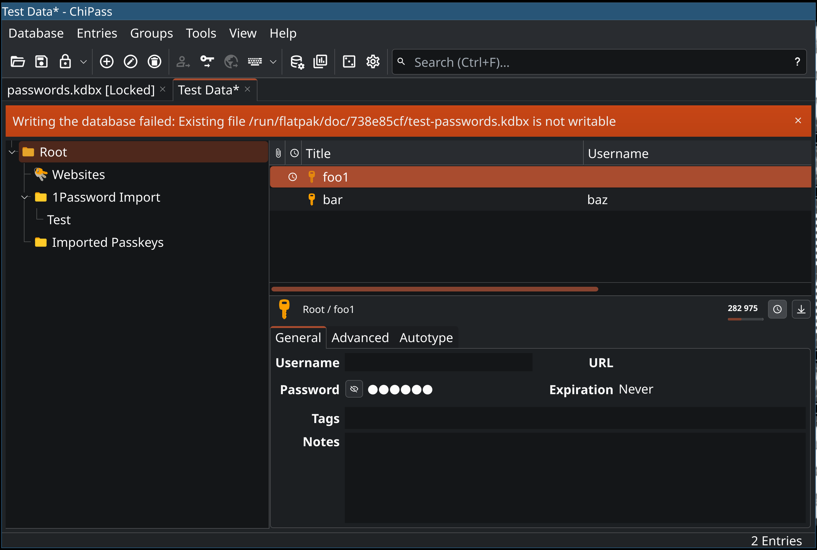
@glyph i'd like to see how you would redesign chipasses toast-style error notification
@whitequark do you have a screenshot?
This comment is unavailable. It may have been deleted or is not visible to you.
at least a 3-pixel border or go home
And another thing (I yell, loudly slamming my drink back down onto the bar) don't put things into modal dialog boxes unless the rest of the application absolutely MUST be stopped until a decision has been made! Provide visual indications of all asynchronous operations! NEVER let asynchronous operations move actionable tap targets! Use explicit disclosure widgets, not tooltips; half of our devices have been touchscreens for 2 decades now!!!
@glyph macOS's "sheets" (that browsers and nobody else have copied) should be the de-facto replacement for every modal in almost every application
re tooltips, this makes me sad. making things more discoverable without making them utterly unusable on small screens / high x-ratios by adding text to toolbars is good. inkscape is my go-to example of how to fail this
This federated comment is not yet available here.


@glyph I had a CSS script for a while that put generated secondary avatars that were deterministic based on username and server and made those more prominent (and not cropped out so short), because of a day when a server did basically this with everyone changing to the same image and display name.
@d_rift really feels like you should not be needing to resort to esoteric and generally inaccessible hacking techniques to get a site that shows you posts to include visual representations of esoteric information like "who posted this" and "when was it posted"
This federated comment is not yet available here.
Now we have "not the main post", where it's displayed in a thread. Mostly the same, but there's a line underneath my profile picture now, I guess to represent thread-ness. Still have the post and the preview, except now the absolute timestamp is gone, and I can't see boosts, although I can see all the other metrics with icons, just not text. Why don't I want to know about absolute timestamps? The relative timestamp has hour resolution, as opposed to the absolute one which had minute resolution.
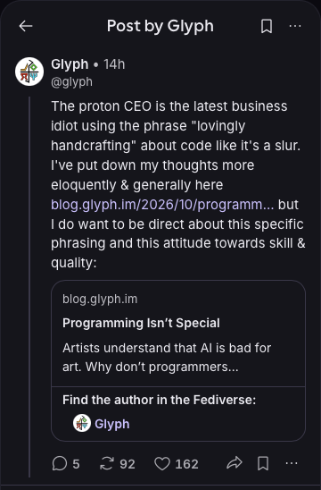
Now we have the same post, in "quoted by another post" mode. All the metrics are gone. The inline preview is gone. Except… in its place, there's just the link, of where the preview should be. And also, where the link should be, there's … nothing … so the grammatical sense of the post has changed slightly; the link no longer serves as a noun. Also it's just the display name, not the handle that posted it, now. There's still tons of whitespace! Why is all this important information now missing?
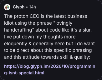
even just the concept of "a fediverse profile" appears in so many different ways depending on context. And yeah, sometimes you have less space, and you need to have small/medium/large versions of certain UI elements. But they should look as similar as possible between sizes, with repeating visual motifs that clearly identify what you're looking at.