

Redirector glitched out and I accidentally looked at new mastodon.social despite my best efforts.
…
lololol *seriously*?! *That's* what advanced mode looks like?!
Discussion
Redirector glitched out and I accidentally looked at new mastodon.social despite my best efforts.
…
lololol *seriously*?! *That's* what advanced mode looks like?!
No, no, don't answer that, I know why. It's because Bluesky treats "feeds" as important. Nobody on Bluesky actually seems to *use* "feeds", but you wanted to be like Bluesky, so you renamed lists to "feeds" and tore useful features such as "making posts" out of the interface to make more space for a giant vertical banner begging us to use the "feeds" feature. The compose box is now clinging desperately to the screen trying not to fall off
@mcc the main reason for the compose box being a standalone thing is to give it more space. and it has more space
starting to post is still a single click as clicking “New post” will open the composer and give it focus
@Claire That does not sound like a useful goal to me. I have never had a feeling that the compose box does not have enough space.
Additionally, if it's going to take up space, I would prefer it to be the unused space (of which the interface has ample quantities) instead of covering up other interface elements.
I was trying to hold back at least a LITTLE on being mean about the interface because the initial blog post seemed at least a little bit principled but no, fuck this, this is VC shit. This is the shit where a PM wants to goose numbers on feature use upward someone was using their "feature" so they shove it in your face. Except it's happening at a *nonprofit* with like four employees so I can't fathom why they'd bother?!
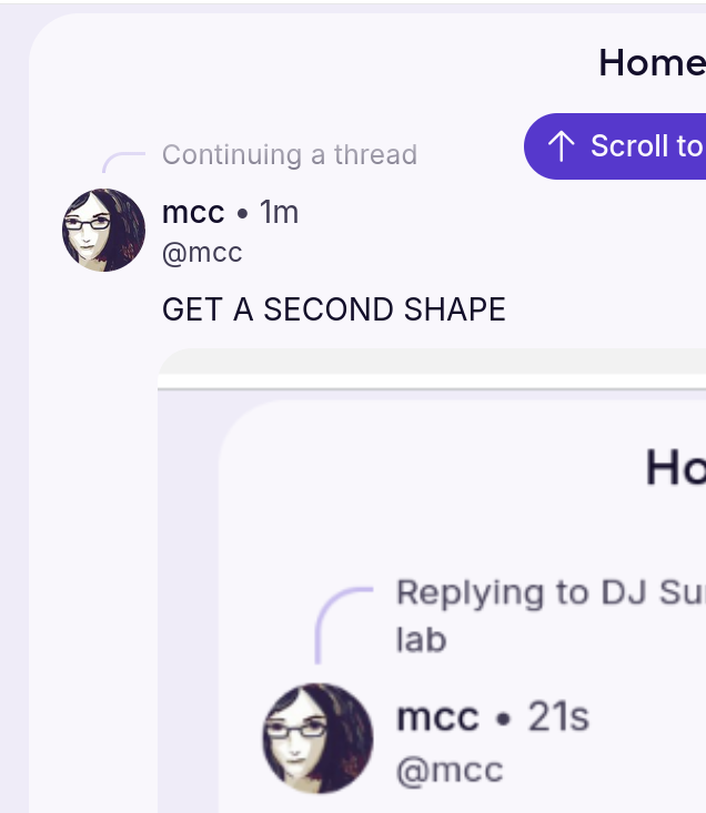
GET A SECOND SHAPE
@mcc I heard you liked rounded corners, so I've got some rounded corners for your rounded corners.
@mcc maybe if they copy bluesky enough it will negate the overblown scale of mastodon fud
@mcc I hate the new UIs lately.

Install Fedizen
Get the full app experience
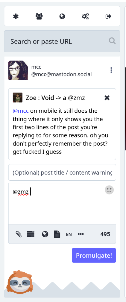


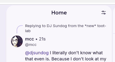





The compose box goes *here*?! Seriously?? Why?? Why that… why those margins?? Why that particular tiny overlap?? Why is the line distinguishing the overlapping from the underlapping box so tiny?
WHY HAVE YOU DEDICATED THIS HUGE BLOCK OF SPACE ON THE LEFT SIDE OF THE SCREEN TO A GIANT "FEEDS" BOX I WOULD NEVER, EVER, I PROMISE NEVER, CLICK ON, I DIDN'T EVEN KNOW I *HAD* THOSE FEEDS, WHEN YOU COULD JUST PUT THE COMPOSE BOX THERE LIKE IN THE OLD, GOOD VERSION OF THEY LAYOUT?