

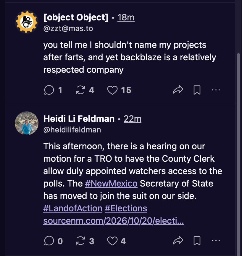
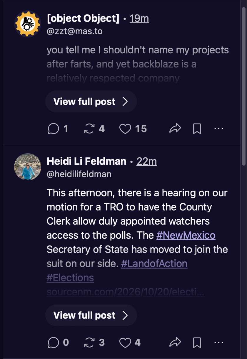
Well this is annoying in the new web interface. With the default font size (⌘0) it looks ok, but go up just one size (⌘+) and it does this "View full post" truncation crap:
2 media files
Discussion
Well this is annoying in the new web interface. With the default font size (⌘0) it looks ok, but go up just one size (⌘+) and it does this "View full post" truncation crap:
The first and second screenshot shows the EXACT same character count, right? Only one has the "View full post" in addition? That's weird.
Why not use a few more rows down if needed? It's not called an "endless scroll" for no reason.
@jwz
It doesn't make any sense since old people need bigger fonts and are more likely to read more than one line.
@jwz the "show more" button seems to take up more space than the link would have in the first place too.
@jwz Kind of wild that VC software quality piss is trickling down the leg of all software. (Of course, this is probably where I find out that Paul Graham actually owns 51% of Mastodon or something.)
@jwz mastodon doesn’t think you want my post about farts to be larger on your screen
can you blame it
Making a list of the times when I would not want to "View full post". Yup. It's an empty list.
@jwz I very rarely don't want to view a full post (some people with instances with much longer character limits who use the platform for blogging which is fine but occasionally I appreciate the feature) but I would like it if people designing software could look at their stuff at 120% and see if the user experience is mostly the same.
@jwz i'm thinking through the reasons why that would happen and they are all dumb

Install Fedizen
Get the full app experience















@jwz This problem should have existed in the old design too, right? The "read more" calculation is based on set pixel height, so increasing font size would hit it sooner.