

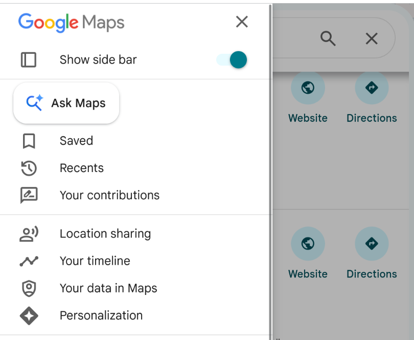
Geez, look at those jacked up margins. it's so funny when you can tell the AI feature itself was vibecoded
0 Boosts
1 Like


Tech Company: At long last, we have created The Map from classic television series Dora the Explorer!
Haha oh my god, every time you open a maps.google.com page now the "ask maps" icon on the left hand side pulses and gyrates going LOOK AT ME LOOK AT ME. Google is SO SO ANGRY that we are trying to use the GUI instead of talking to their chatbot


@mcc ask maps, because everyone knows that following written directions is way easier than using a GPS UI. That's why everyone asks random people for directions then writes them down when they want to go somewhere, and why maps are just lists of directions written out from common destinations to other common destinations.


@mcc SO ANGRY. Also, I have no proof of this but I feel in my soul that GMaps going dark on me (literally making it so I can't see anything) when I try to use it signed out in a private browser with UBO on is them being petty and spiteful that they can't have more of my data
It's very funny that around 2010 all the color was removed from buttons in interfaces, never mind if this made the interface harder to read at a glance. And at the time the theory as I understood is that UI should not "call attention" to itself, color should be reserved for user content. Except now we're moving color back into UIs, but *ONLY* as highlight for the AI button, to indicate that the AI button is the Only Correct Button and if you are pressing a different button you are doing it wrong

@mcc This should be required reading for every software engineer that makes any interface design or decision.
The Design of Everyday Things by Don Norman: https://ia902800.us.archive.org/3/items/thedesignofeverydaythingsbydonnorman/The%20Design%20of%20Everyday%20Things%20by%20Don%20Norman.pdf

@mcc we got new machines at work, and one of the complaints we're getting a LOT is that the UI elements are so low (for ADA and children) that it's requiring people to lean down. this is resolved by a button right on the front that moves the buttons to the top.
That button? a generic hamburger icon
Or I guess if you're Firefox, you remove all the semantic information-communicating color from the interface so you can add it back in as entirely random, asemic rainbow colors everywhere for no reason at all
@mcc TIL "asemic", really wish I did not immediately have uses for this word

@mcc This feels like a monkey's paw about text-based interfaces


@mcc Just in case you missed it....
I can only give a resounding, emphatic, and unambiguous "Maybe Later."



@mcc it doesnt show up to me