

Curious, as I've been testing the upcoming Mastodon design in our dev environment for the past 2 days. The new design isn't widely available yet, but [mastodon.social](http://mastodon.social) likes to test with real users and installs alpha versions early.
So, a quick poll for [Mastodon.social](http://Mastodon.social) users and anyone on other instances with the new v5 design enabled (feel free to share this to reach more people):
#Mastodon #Mastodon5 #MastodonAlpha #MastodonNightly #NewMastodon #MastodonSocial #Design #UI #UX




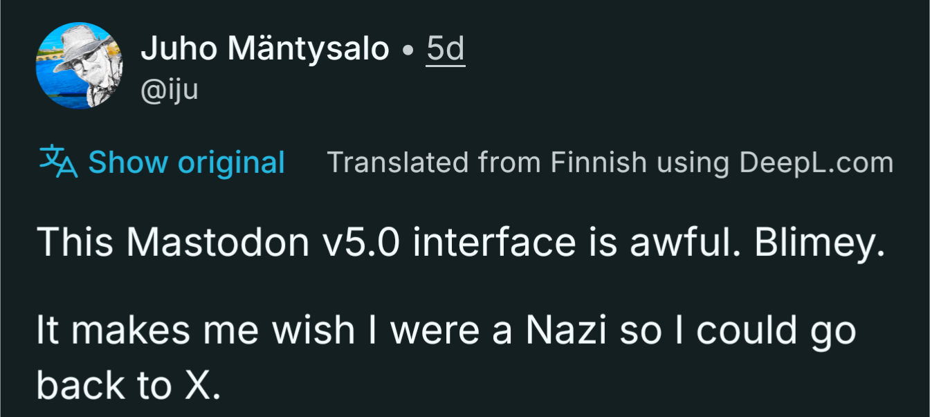





@rolle There's one thing about the new design that really annoys me. The transparent shade just below the header that partly hides the top post as soon as you begin scrolling a bit. It touches what I'm reading, which should not happen.
I'm assuming that whoever designed that is not using a smaller monitor/ resolution or using the manual refresh of the timeline. The other elements also seem to work better above full-HD resolution.
I'll probably try to fix it client-side if it doesn't improve.