

I had a vote on the size paragraph breaks for my book manuscript yesterday, and 0.5em won.
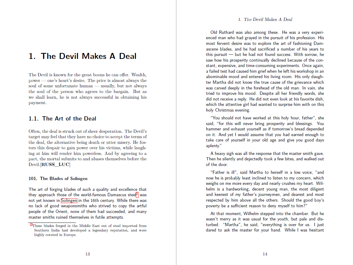
Now I have a question for #TeXLaTeX #typography experts. I use two different #fonts in my books to distinguish between #CreativeCommons Zero texts (my translations of German folk tales) and the material which isn't Creative Commons (my commentary, footnotes, and explanatory texts).
So far, I've simply used the default font for the non-CC text elements and \textsf for the CC elements. But since I am messing around with the layout for my next book anyway, I might as well ask what the experts around here recommend.
However, I do want to stress that these should be commonly available _LaTeX_ fonts - installing an extra package is okay (if you point me into the right direction), but recommending me Windows fonts or the like which require me to jump through some extra hoops is not.
My LaTeX setup is complicated enough as it is, and I don't want to introduce any extra break points.



@juergen_hubert It's offline right now, but this should be very easy to set up with just about anything in the LaTeX font catalog.
https://tug.dk/FontCatalogue/seriffonts.html
I can give you specific fonts if you want, and give you the one or two lines of code that it takes to flip between them